Leveraging Music and Artwork to encourage writing.
A meditative writing application with immersive genre-specific themes.

Duration: June 2019 - Current | Role: Founder, Designer, Developer | Current Status: Active at 30,000+ users
How the project started
After having written for the high school newspaper for a few years and quite literally writing hundreds of essays for college applications, I became very familiar with all the famous writing apps and explored some niche writing apps out there. It became obvious that the whenever we write, our workspace is usually some variation of the the following:

I didn’t have any problem with the setup but figured I should take this as an opportunity to solve an ‘itch’ that I had with the setup. The amount of friction involved in getting your first draft going didn't do justice to the delicacy of the idea that we could get out there if given an appropriate environment. Ideally, I would like to see something like this:

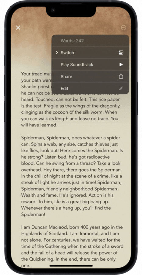
While the application provided you with ambient background music to help you focus and get you in the ‘mood’ to write down your first draft. The music, however, had to be non-impeding so that it fell into place automatically and didn’t agitate the user.
Constraints
It was critical to understand that providing users a blank space wasn’t the obvious solution. If that were the case, users would rather use TextEdit on a Mac or a Notepad on Windows. I knew I had to:
Provide users just enough options while keeping a clean interface
Have the program create ambient environment using mild visual and music
Let the user have control over what kind of environment to set
I knew an app like Ommwriter existed but I found their UI confusing and it wasn't obvious how to save your content. They also had a lot of options that an average consumer might not need and it seemed like the music tracks were hardcoded into the app with the user having little to no control. At least that was true back in 2019.
2019
Initial Release • ~200 users
The first version was a simple webpage with a plain white background that allowed users to write as the webpage played ambient music. Super bare bones. I decided to go beyond the plain white background and add various themes a couple days after launch. The algorithm picked up music tags (Rnb, lofi, ambient, classical), sorted them, shuffled them and played it depending on what theme the user was going into.
2020
v3.0 • ~1600 users
Users had concerns about saving their texts. Developed the platform to be data persistent on the client side by leveraging their browser’s local storage.This allowed users to save text locally hence avoiding a sign up process and reducing friction. The web app architecture scaled automatically to the count of users with no server-side interference.
2021
v4.0 • 11,000 users
Users expressed the desire to change the background and music as they write. Altered the algorithm such that it enabled shuffling background and music while staying within their genre. The web app carefully re-framed the soundscape, but still used the same musical instruments in order to avoid startling the user. The web app was written from scratch to accommodate new dynamic themes (illustrations with background movements that assist in focusing) that were carefully curated and tested by alpha users over weeks.
Current Standing in 2022
30,000 users • iOS, macOS, Windows • 100+ Countries

What had to be accomplished in v5.0?
The web app had been sitting at around 11,000 users for around four months and I had been gathering critical feedback from users all around the world for a semester. I realized these were the main concerns that people had with Frost Writer:
They desperately wanted a desktop app so don’t have to write in browser which would make their experience inconsistent depending on their browser and operating system
Several users expressed they would like to save their writings in their own cloud accounts and wouldn’t mind a sign up process if Frost allowed them to have their own storage space (although they also seemed to like the ‘no sign up’ approach that was already in place)
Some expressed interest in having the ability to access their writing from their phones if they were to have a cloud based account but there was very little demand for that since users primarily used desktops to write.

The Desktop app
The desktop app was an opportunity to create a more user-friendly Frost than ever before. I understood the needs of users and was starting from scratch as far as design. I had very good data on what components users liked and what components acted as frictions in the users' way of writing. I also didn't have to be constrained by a browser's limitations so the possibilities were quite endless. I took this opportunity to prototype a desktop version of Frost that was totally different than the web version.
Even though the process itself was full of iterations, this is what I wanted to achieve from the desktop app in specific:
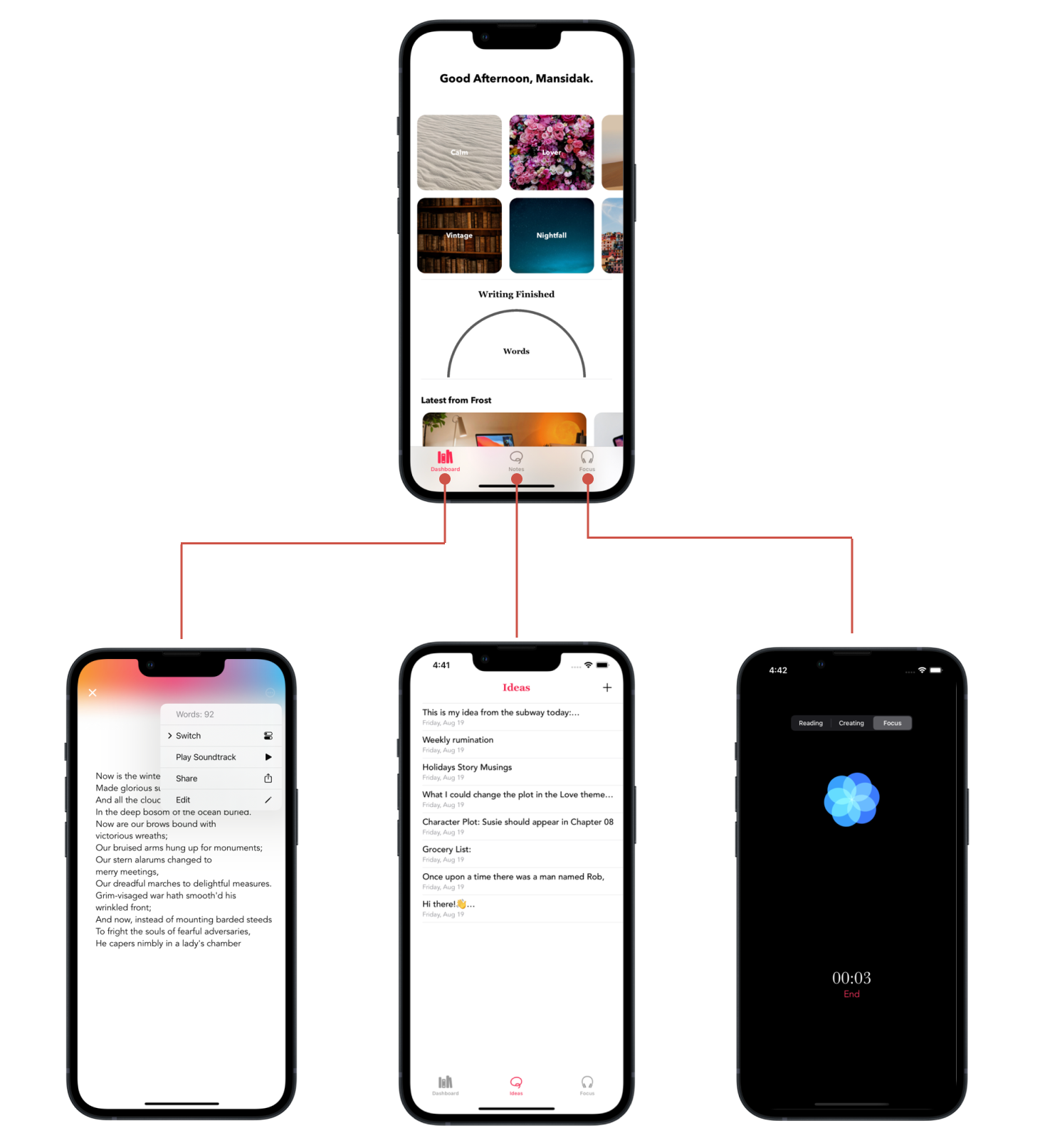
Provide users a personalized dashboard with their cloud based accounts
Let users create ‘quick notes’ in addition to whatever they wrote in the themes. Sort of what Apple Notes on Mac already did. But imagine combining apple notes with macOS Pages: that’s exactly what I wanted to do with the ‘quick notes’ section.
Let users export their writing in various formats, txt, docx, pdf.

If I recall correctly, I had to go through around a week long iteration of exploration and prototype for a ‘perfect’ dashboard for my users. I researched what the existing famous dashboards looked like and what they achieved. The following were the dashboards I derived the most inspiration from: iCloud online, Apple TV+, Xbox.
I had to make sure that the user could achieve the following tasks without any confusion via their dashboard: start a new document in a theme, create/edit Quick Notes, delete documents, access focus modes (more on focus modes in a few seconds) and access account settings.
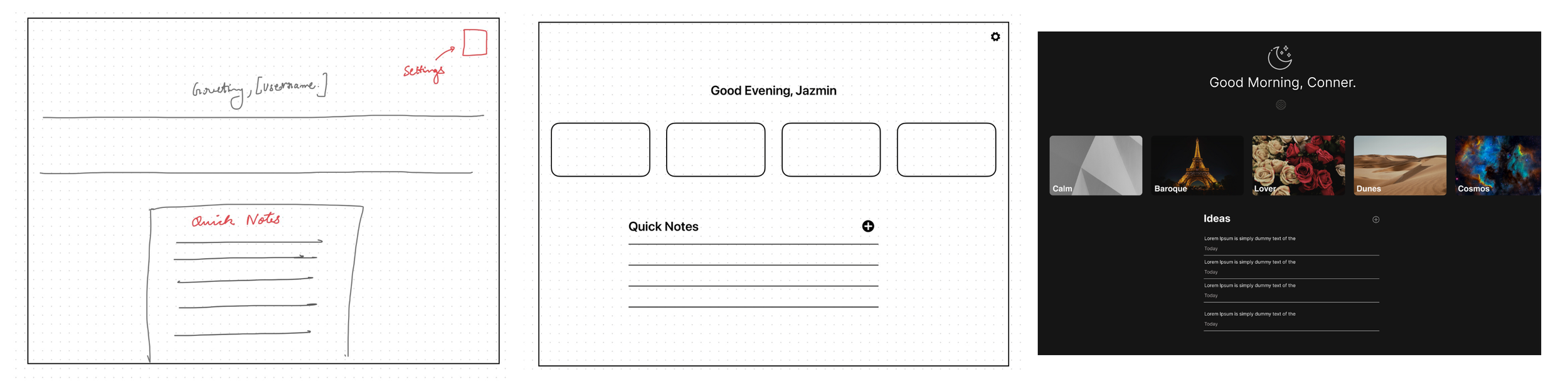
The final render looked like this:

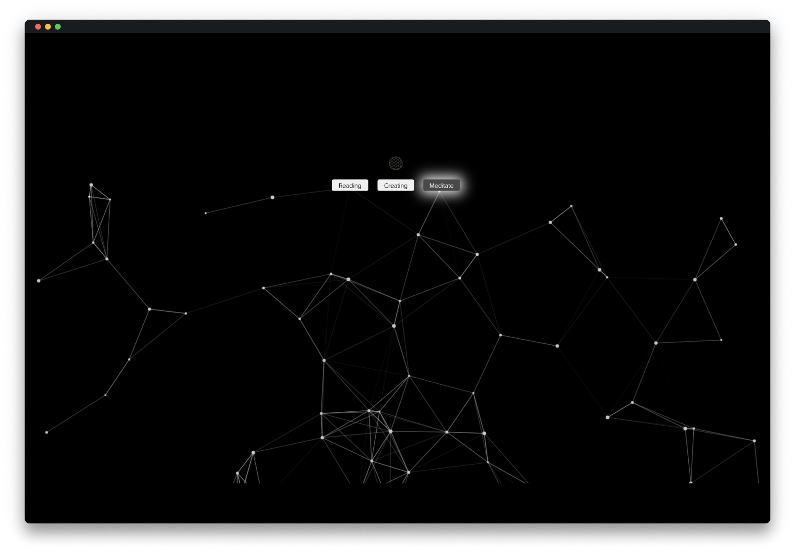
After paying close attention to user feedback, I discovered that several people used Frost for tasks outside of writing which was quite an interesting finding. They often used Frost as a background music playback app, some used the sounds to fall asleep, and some also used it as background noise while doing other tasks outside the app like reading, researching, etc. I decided to add a section called ‘Focus modes’ which blocked everything else in the app and gave them three options to choose a personalized music station based on what they were working on: Reading, Creating, Meditating. The app’s background would change to a soothing floating particles visualizer.
The iOS app: Motivation behind quick notes
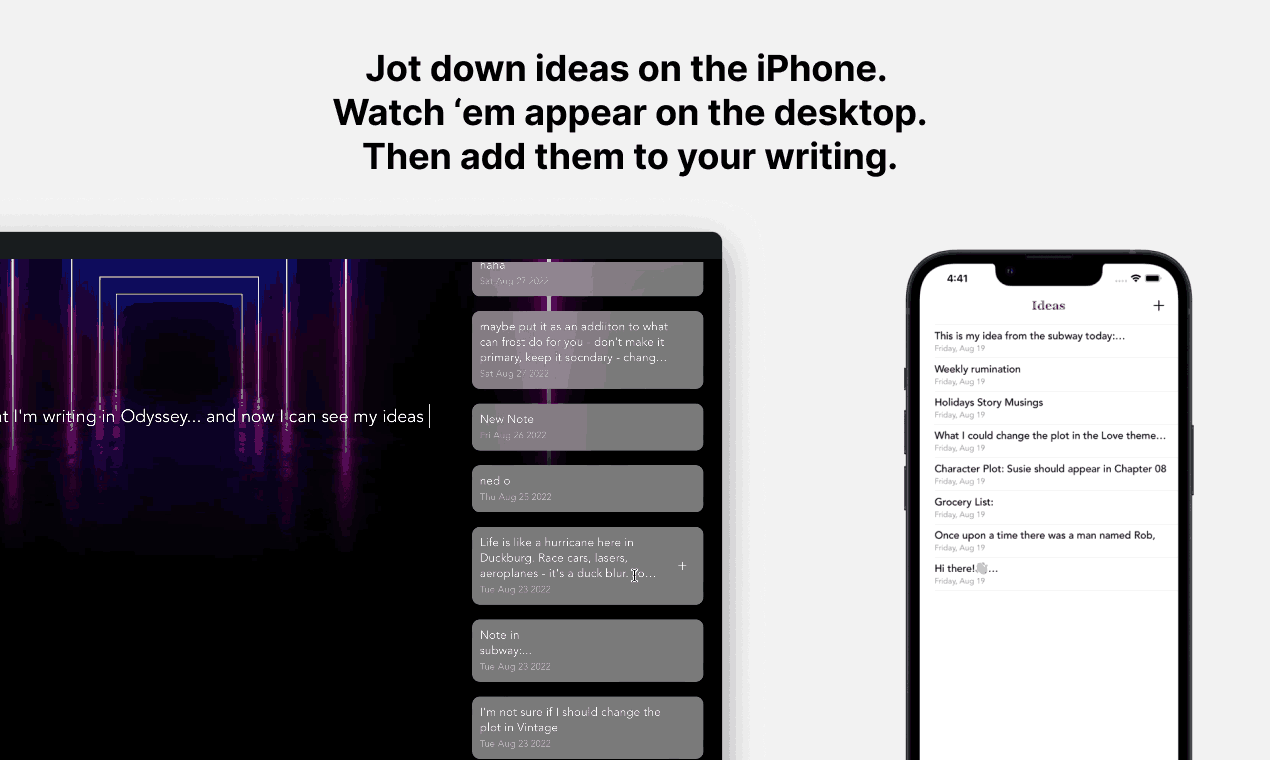
The initial motivation for adding quick notes in the desktop app was that users would be able to jot down ideas without having to start a new document. However, I realized that it would make more sense for users to be able to add quick notes from their iPhone and view them later on the desktop under their dashboard.

I asked myself: Why would someone use the quick notes option on the Frost iPhone app if they could do a similar job on Apple notes and later access them on their Mac? The concept of ‘references’ came in. Once the user writes down an idea on the iOS app they can not only view it under dashboard on the desktop app but also hit ‘cmd+R’ to view their ideas as a sidebar while writing within a theme, and hit the plus ‘+’ sign to directly add them to their writing.
And all of a sudden the entire design philosophy fell in place and the iOS app started making a lot more sense. However, the biggest problem hadn’t been solved yet.
Solving the keyboard problem
My users expressed interesting in being able to access their stories and writings that they wrote on the desktop app on their iPhone. I quickly realized that adapting the design philosophy that Frost followed on a desktop environment to a mobile environment would be quite tricky due to one big reason: the keyboard takes up half the real estate. This would prevent users from being able to enjoy the background themes in the same way they can on the desktop app.

I had been thinking about this problem for a few months but always had it on the back burner as I was working on the desktop app. However, after talking to a few users I discovered something super interesting. I realized that the main motivation behind accessing your writings from the desktop on your iPhone is to be able to reference them, or make quick edits.
The primary goal of a user when on their iPhone is NOT to start a new document, it’s rather to view a previously written document or edit it.
This meant that all I had to do was add the ability to read their documents which means they can still enjoy the background themes since there’s no keyboard. And if they really had to make an edit they could enable ‘edit mode’ that would take away the background theme and show a keyboard. Once they’re done editing they can exit out of editing mode and go back to reading their story with all the background imagery and soundtrack if desired.
Firebase: A word on the back-end
I had decided to use Google Firestore for the back-end. I adapted my app to use Firebase for both SwiftUI and JavaScript in order to allow for seamless syncing among users’ devices. Firebase has a very intuitive setup even though their documentation isn’t the best. After creating a MVP (minimum viable product) version of Frost for iOS and macOS I decided to get some ALPHA users to understand the read and write rate of up to 20 users and see how the code would scale. I realized quickly that my code wasn’t optimized for multiple devices and was clearly not optimized for 11,000 users that I had at the moment. I put a pause on developing the design further and decided to alter the read and write functions between my front-end and back-end.
After spending a few days on understanding how to cause minimum amount of reads and writes to Firebase while maintaining lightning fast sync, I sent out a BETA that had exceeded my users expectations. They had no issues with synchronization, and the UI seemed super intuitive. It was time to ship a final BETA to more users to and then prepare for launch in late August.
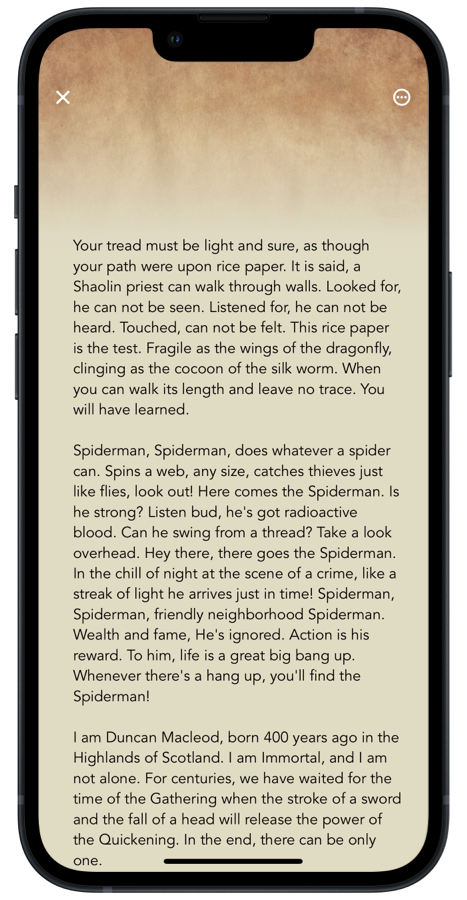
Final iPhone app
The Rollout
Version 5.0 was officially launched on Product Hunt and the App Store on Aug 29, 2022 and ended up with 2200 new users in the first 24 hours, 200 upvotes and 60 reviews. As of now (Nov, 2022) the app is sitting at 30,000+ total users in over a 100+ countries. The launch video can be viewed below and the PH launch can be found here.
November 2023 Update
I think it’s worthwile to mention that as of November 2023, I’ve picked up Frost again and the latest development's demo can be viewed here: Demo.

TREP Expo Conference Poster and Demonstration (Nov, 2022)
